Sunday, November 30, 2008

Star Plots


http://start1.jpl.nasa.gov/images/MERStarPlot.gif
"In this star plot, the center represents the most desirable results. The red line represents the handcrafted MER IDD, and is used for comparison and validation of the approach."
http://start1.jpl.nasa.gov/caseStudies/autoTool.cfm
Star plots use a design with "spines" radiating from the center, with one spine for each variable.
This star plot is from the NASA studies related to automated engineering design studies for the Mars Exploration Rover (MER) Instrument Deployment Device (IDD). Looking at the "Mass" spine, Design 1 was the least desireable for that variable. Design 1 fared better for Link Deflection.

Correlation Matrix


A correlation matrix such as the above provides the statistical correlation values for variables down a row and across a column. The diagonal down the middle will be the correlation of 1, since that is the same variable on each side. The two triangles formed by this red correlation line are mirrors of one another. The user is able to compare correlation values between the variable in the squares that are not on the diagonal.
This correlation matrix is from a study on gene expression patterns and potentially developing a model that relates to humans and cancer. "From Genome to Phenome:Here is Looking at You and Your Cancers", Antonio Reverter, Wes Barris, Sean McWilliam, Greg Harper and Brian Dalrymple. It is a "Correlation matrix for a subset of the top 100 cancer genes. Thick lines indicate blocks: A for extracellular matrix; B for nucleus and cell progression; C for actin cytoskeleton; D for fatty acid metabolism and E for glutamine/glutathioine/oxidative. stress (png file)." The grouping of the seven extracellular matrix genes in the top left corner all have a high degree of positive correlation to one another, and four of the nucleus & cell progression genes do.

Similarity Matrix


http://www.fxpal.com/systems/MediaAnalysis/sim10000.gif

This similarity matrix illustrates photo similarity in a study related to organization of digital photo collections.
The authors of the paper "Temporal Even Clustering for Digital Photo Collections" were attempting to address the growing use of digital photography and develop methods for developing user friendly software for organization and retrieval of photos. This matrix is from their paper. (Matthew Cooper, Jonathan Foote, Andreas Girgensohn, and Lynn Wilcox). http://www.fxpal.com/publications/FXPAL-PR-03-215.pdf
"The similarity matrix above visualizes the temporal similarity of a collection of 512 photos. To compute the matrix, K = 10000. For each matrix, a photo-indexed novelty score is computed by correlating a checkerboard kernel along the main diagonal of the similarity matrix as described in this presentation. Starting with the coarsest scale (largest K), peaks in this score are detected and a hierarchical set of event boundaries is generated. A confidence measure trading off intra-event similarity and inter-event dissimilarity is used to select a single level of the hierarchy for presentation to the user. The similarity matrix above visualizes the temporal similarity of a collection of 512 photos. To compute the matrix, K = 10000. " http://www.fxpal.com/?p=eventDetector


Stem and Leaf Plot


Stem and leaf plots are somewhat similar to histograms: they illustrate the frequency of occurance of data in a range. However, stem and leaf plots show the exact numerics for the range, and would be like a "histogram-on-it's side". They can be used to see a distribution pattern in the data.
The "stem" is the first digit (or "tens" digit in this case) of the number, and the leaf is the last digit (or the "ones" digit in this case). The ages for this group are 1,8,9,32,34,37,45,51,55,and 81.

Box Plot


http://www.statmethods.net/graphs/images/boxplot1.jpg
Boxplots provide a simple way to illustrate data and are useful for comparing data sets, according to our class notes. The "box" portion is divided at the median, and ends at the 75th percentile at the top, and the 25th percentile at the bottom. The final "whisker" at the top represents the higher end of the data (from the 75th percentile up) and the bottom "whisker" is the lower data (from 25th percentile down.) The above box plot compares mile per gallon use in cars with 4, 6, or 8 cylinders. It appears that the medians are over 25, just below 20 and just above 15 respectively. Below is a sample box plot schematic, for reference.

http://www.dmreview.com/media/assets/article/1033566/Few-fig3_350px.gif


Histogram


http://www.fsec.ucf.edu/en/research/buildings/schools/images/histogram.gif
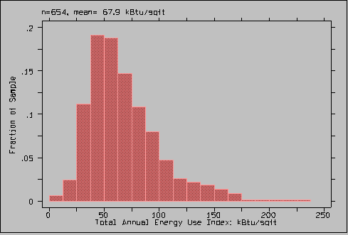
Histograms provide a method of visualizing frequency data in intervals. They can be used for discrete or continuous data. This histogram gives the energy use for fractions of the sample, and is categorizing it into annual energy use per square foot. It is based on a 1996 survey of Florida public schools. The two largest bars (in histograms area of the bars is the key as opposed to height) occur just before and just after 50 btu/sqft and occurred in between .175 and .2 of the sample.

Saturday, November 29, 2008

Parallel Coordinate Graph


This olive oil data is plotted on a parallel coordinate graph, where a vertical axis is used for each variable. Color can be used to highlight a specific level or data element such as the region of Inland-Sardinia above. According to our class notes, these visualizations can be used to examine relationships between variables.

Triangle Plot


This is a slightly different version of the sample triangle plot from our class notes. It illustrates the relationship of three variables/components of soil (sand, silt and clay) by percent-weight and provides the name classification for that combination. I chose it as a sample for its clarity and simplicity.

Windrose


http://www.iit.edu/~ipro307f/project/final.html

A windrose depicts frequencies of windspeed and from which direction they occur at a location. This windrose is based on a data set from the Illinois Institute of Technology carrying out a wind turbine energy generation study in 2003. Winds from the northwest, west and southwest prevail. Their website (link above) explains that along with a wind compass and detailed measurements, the turbine will be placed for maximum efficincy due to strength of the winds and turbine requirements related to flow.

Climograph


Climographs illustrate temperature (bar graph) and precipitation (line graph) together, monthly, for a region. This is for Manaus, Brazil, at 3.13 S, 60.00 W.

Population Profile


This is the population profile (which depicts male/female and age groups distributions) for coventry, England on April 29, 2001. Total population count was 300,848. It also provides dashed lined to compare Coventry to the national average. This type of profile can provide a visual regarding birth and aging/death rates. (http://images.google.com/imgres?imgurl=http://www.coventry.gov.uk/ccm/cms-service/stream/image/%3Fimage_id%3D1660022&imgrefurl=http://www.coventry.gov.uk/theme/loop/redirect/%3Foid%3D%255Bcom.arsdigita.categorization.Category%253A%257Bid%253D1665010%257D%255D&usg=__DTrgPVL09cD8u-6KekZFouiirfY=&h=327&w=532&sz=54&hl=en&start=1&tbnid=dD14UsOf7i8g3M:&tbnh=81&tbnw=132&prev=/images%3Fq%3Dpopulation%2Bprofile%26gbv%3D2%26hl%3Den%26sa%3DG)

Scatterplot


http://www.uv.es/prodat/ViSta/vista-frames/help/lecturenotes/lecture11/weight&horses-scatterplot.gif

Scatter plots depict the realtionship between two variables; in this case, automobile weight and horsepower. If a trendline is placed inside based on the means of the data, one can tell if the relationship is positive (both variables are increasing) or negative (one variable increase and one decreases). In this plot, there is a positive relationship. Using statistics, the amount of the relationship can be determined (correlation), but correlation does not mean there is "causation".

Index Value Plot


Index Value Plots chart a value tied to an index instead of an absolute number, according to our class notes. This Multi Family Applicant Risk Index (MAR) is a national risk index used for apartment complex owners/management to compare their tenant risk profiles to a national index. This chart shows All bedroom, 1 bedroom and 2 bedroom data for the range of Riskier Applicants to Better Applicants. A MAR of 100 means market conditions are equal to the mean for the national index in 2004 (the base year). (http://www.duedee.com/news/194864/First-Advantage-SafeRent-Releases-Second-Quarter-2008-Multifamily-Applicant-Risk-Index/)

Accumulative Line Graph- Lorenz Curve


http://www.northlan.gov.uk/business+and+employment/local+economy/economic+information/lorenz+curve.jpg
The Lorenz curve depicts the presence of income inequality in a population by charting the income levels of the population cumulatively. The further bowed and distorted from the 45 degree center diagonal, the greater the inequality. In this chart, the degree of inequality increased from 200/2001 to 2005/2006.

Bilateral Graph


http://www.treas.gov/press/releases/images/november%20jobs%20graph.jpg
This bilateral graph shows data crossing for the rate of unemployment falling and jobs rising, as well as provides reference lines for the average unemployment rate and the date of signing of the Jobs and Growth Act in May of 2003. Bilateral graphs can illustrate trends and changes above and below a reference level (such as zero, a point of intersection, a desired level, and others).

Sunday, November 23, 2008

A Variety of Choropleth Maps

In a previous post there is a general description of choropleth maps- maps that depict information based on data from specific regions or areas such as states, counties, or districts. Choropleth maps can be further divided into categories:


Classed or Unclassed

A classed choropleth will take the area units and divide them into groupings based on a chosen range. For example:


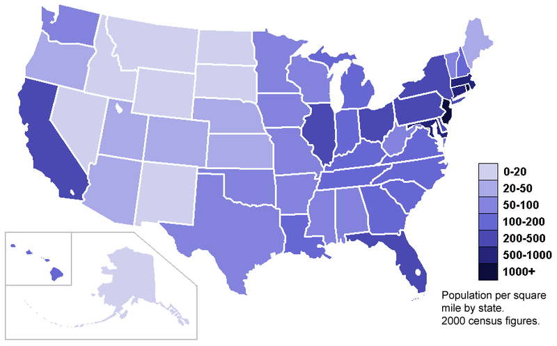
Above is an unclassed choropleth of the United States, and below the states are divided into 7 groupings based the population density in a classed choropleth.


upload.wikimedia.org/wikipedia/commons/thumb/...


The decision about number of classes and ranges must be made with the information and detail desired in mind, as well as how visually distinctive it will be able to be. A common number of ranges is four to seven. To arrive at the appropriate size of each range mathematical processes of equal steps, quantiles, natural breaks or minimum variance can be used.
Bivariate and Univariate

Univariate choropeths illustrate one variable and bivariate choropleths illustrate two.

The univariate below shows a range from blue (100% Democrat) to red (100% Republican) for US counties.


The bivariate choropleth below depicts the number of human West Nile Virus cases as well as the disatnce from the Mississippi in which they occured.


Standardized and Unstandardized

Standardized choropleths have taken the data and averaged or standardized them in some manner for the areas. An example would be population per square mile to show density rather than only a numeric value. Another example would be to show data as a percent.

This Electoral College map is not standardized, but gives the numeric value of EC votes per state.

This map is standardized showing population density in the states.

Nominal

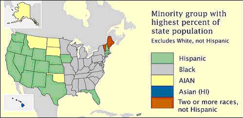
A choropleth depicting nominal data shows a specific variable that is not in an order or rank. This example provides the answer to "which minority makes up the larget percent of the total state population" but there is no value, or order provided.


Proportional Circle Maps


http://www.lib.utexas.edu/maps/europe/west_germany_ind_1972.jpg
Continuously Variable Proportional Circle Map
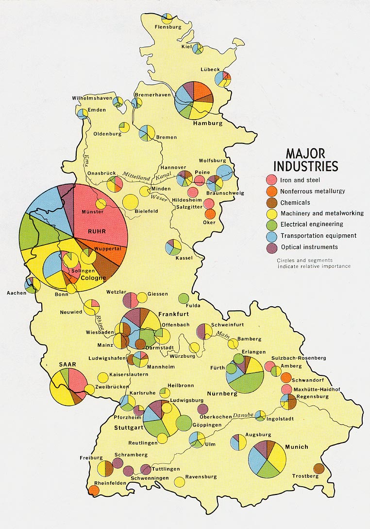
This map (above) of West German industries uses color for industry type and circle portion/size for relative amount of the industry in the region.


http://mapmaker.rutgers.edu/355/dotProporCircle.jpg
Range Graded Proportional Circle Map

This is a map that has clearly defined range graded proportional circle aspects to it, as well as the use of a dot format for the rural areas.


Maps known as "point pattern maps" can be used as a tool to illustrate patterns of occurrences in and between locations. Examples would include population, libraries, crime, income level, and voting patterns. Dot density maps and porportional circle maps are two types of point pattern maps.

Dot density maps are nonproportional (the dots will be of equal size and represent a fixed number of items) and can be nominally differentiated. In contrast, porportional circle maps use different sizes to illustrate the proportions of the variable being viewed.


Proportional circle maps will either be continuously variable (there will be many sizes that portray the range of the data) or range graded (a specific number of circle sizes will be chosen and a range assigned to each).

Saturday, November 22, 2008

We're in Our "4-D's" now: DRG, DLG, DEM and DOQQ


USGS Digital Raster Graphic (DRG)
pubs.usgs.gov/of/2003/of03-471/domier/index.html .


USGS Digital Lind Graph (DLG)
pubs.usgs.gov/of/2003/of03-471/domier/index.html .


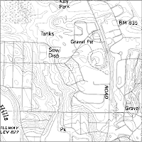
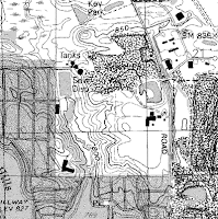
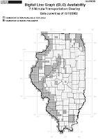
The USGS has produced a series of georeferenced topograhpic maps. According to class notes, it was reviewed that this means they are "tied to a coordinate system, a datum and a map projection." These maps are also called "topoquads, taken from "topographic quadrangles". They represent rectangles in a scale of 1:24,000 where 1 inch equals 2000 feet, and cover an area 7.5 minutes latitude by 7.5 minuntes longitude.

DRGs (digital raster graphic) are images scanned from these topoquads. "Raster" is information that is based on pixels. DLGs (digital line graphic) are vector information, which is based on polygons, lines and points.


The DRG and DLG above are for the same location in Illinois and make a nice comparison. The outline of the state topoquad is included below for general reference.


http://ess.nrcan.gc.ca/ercc-rrcc/theme1/t9_e.php?p=1
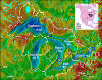
This Digital Elevation Model (DEM) of the Great Lakes. DEMs use raster (pixel) coding, similar to DRGs, and the color enhancement adds to the dimensional relief effect.


http://www.consrv.ca.gov/index/PublishingImages/You_are_here.jpg

The Department of Conservation in downtown Sacramento, California is shown by the arrow in this Digital Orhtoquarter Quad (DOQQ) image. DOQQs are georectified, georeferenced aerial photos. They are designed to remove the distortion that can occur with aerial photos, and have the benefit of more accurate measurement of positions and angles.

References for this post include class notes and pubs.usgs.gov/of/2003/of03-471/domier/index.html .


Contour Maps: Isobars, Isotachs, Isohyets, Isopach, and Isopleths

In an earlier post there is an example of a hypsometric countour map: a topographic map showing surface relief. The lines that make up topographic contour maps are called isolines.

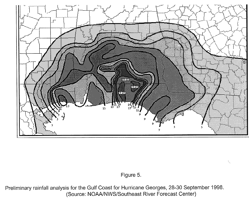
In general, contour lines join areas of equal value of the variable that is being measured and are also known as isopleths. The distance between the contour lines depict the rate of change in that third variable. If the distance between the lines is close, the rate of change is larger over a smaller distance. These lines are also know as isopleths. There are a variety of specialized isopleth maps. Examples include: bathymetrics (show sea floor elevation), isohyets (show rainfall), isopachs (show rock or sediment), isotachs (show wind speed), and isobars (show air pressure).


The above map illustrates isobars of air pressure. Where the lines are very close together, there is a larger rate of change in a small distance, and a resulting increase in air movement.


Isotachs in the image above connect areas of equal wind speed. This is from tropical storms over the pacifice in 1997.


The areas of rainfall in the Florida panhandle are shown in the isohyets above for hurricane Georges in 1998.

The final image (above) for this section uses ispoachs and is showing the natural gas field in Texas known as Barnett Shale.

Wednesday, November 19, 2008

LIDAR Remote sensing Image

http://www.nasa.gov/images/content/55642main_lidar2.jpg

LIDAR differs from radar or Doppler in its use laser per class notes: "light amplification by stimulated emission of radiation") to produce images.
According to the website http://twistedphysics.typepad.com/cocktail_party_physics/2007/09/index.html,
the uses of LIDAR are expanding from the detailed information we have gotten regarding surface changes, environmental changes, and elevations (accurate to approximately 6 inches in elevation), to include geology, seismology archeology and search & rescue efforts.

Doppler Radar Florida 2006

http://www.srh.noaa.gov/tlh/images/landfall_0606131619.png
Another technology in the area of Remote Sensing includes"Doppler" Radar. Doppler uses microwave frequences as opposed to radio frequences ("radar"), per our class notes. We are most familiar with this via weather or atmospheric reports.

Black and White Aerial Photograph of Mt.St.Helens


Above is a black and white photo of Mt St. Helens (copyright 2002), and below is and infrared taken in October 2004 for comparison.


http://www.pacificviews.org/weblog/archives/Pictures/st_helens_infrared.jpg

Mt. St. Helen's Webcam:http://www.pacificviews.org/weblog/archives/Pictures/st_helens_infrared.jpg

Infrared Aerial Photograph of California Kelp


http://gis.esri.com/library/userconf/proc01/professional/papers/pap900/p9008.jpg

According to class notes, remote sensing includes various technologies including photos taken using infrared. This uses a film emulsion that will detect and react to lightwaves humans are unable to see because they are outside the degree of electromagetic range for our vision. "False color" is used, or the image would be invisible to us.

This infrared kelp photo and following text is from: http://gis.esri.com/library/userconf/proc01/professional/papers/pap900/p900.htm
"DFG [Department of Fiah and Game]photos were scanned at 700 dots-per-inch (dpi), whereas the IK Curtis and Pacific Aerial photos were scanned at 400 dpi. All were saved as standard .jpg files. While the scan resolution was greater (and the original scale smaller) for the DFG photos versus the contractor photos, the approximate ground pixel size is 2 meters for all photography. The raw digital images were saved to CDROM. Processing priority was given to kelp-bearing photos, so presently, there are some gaps in the coastwide, digital versions of the photography.
Georeferencing: The process of using digital aerial photography in a GIS requires a processing step known as registration or georeferencing. Aerial photographs have a nominal scale, but that scale is not constant throughout the frame. This registration process attempts to correct for scale changes and inherent photo distortions, as well as to add an earth-coordinate system, thereby allowing other digital layers with similar spatial coordinate systems to be co-registered with the photography. There are several methods for performing the registration process and various levels of accuracy associated with each method. The 1999 kelp survey employed two registration methods. In the initial phase of the project, sophisticated photogrammetric processing was used under ERDAS Orthobase, version 8.4, software. This process was applied to single frames of aerial photos and employed camera parameters, camera orientation and position, and corrected for scale changes due to terrain elevational changes.
As an alternative approach, a simpler affine transformation was used for georeferencing the aerial photography under ArcView v3.1/Image Analysis Extension, v1.0.
Indexing Aerial Photography:After georeferencing the kelp aerial photos, DFG prepared a separate ArcView shapefile for each photo series by source. A polygon (or "wire-frame") delineating the "footprint" or net coverage of each photo frame was screen-digitized over the photo display itself. "

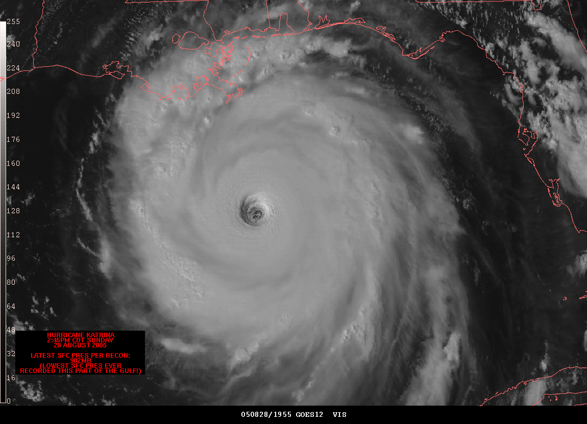
Cartographic Animation: Hurricane Katrina Flooding

Hurricane image: http://www.spc.noaa.gov/misc/carbin/katrina/kat5_1945.gif


This is a very basic example of cartographic animation with the use of a planimetric map enhanced with an animation of the devastation hurricane Katrina wrought. For this particular type in infromation, GIS technologies of digital raster graphics, digital line graphs, change detection, georectifcation, modeling and others were possibly employed. As mentioned in the last post, the multitude of uses and the creative, visually interesting ways geovisualization, cartography, and now animated cartography can be combined is tremendous. It has many possibilities, including the usual caveat we have learned about in class: the producers and users may bring their own inferences and messages to this form of communication. The use and interpretation of information may need to be analyzed carefully.
The article we read by Ralph Lengler and Martin J Eppler, "Towards a Periodic Table of Visualization Methods for Management strove to organize this large arena of information and possibilities and concepts relating to it for uses in management specialites. This is one of those post categories where I wish we were allowed to include more than one!

Tuesday, November 18, 2008

Statistical Map

The post just previous to this was a cartogram; a very interesting way to depict information about an area. When I was reading our Geovisualization units notes on statistical maps, there were two slide examples. In one, the definition of statistical maps included defining distance using "mathmatical definitions of time and space" , and the topic was probability of a popular song "hit". The visualization was shown in balloon-like figures and the distance to "hit" balloons was the variable. In the other slide, and had an example of a flow diagram for flu virus evolution that related to a world map projection showing the locations. The striking point of the last post and this one is that there is such a large array of potential ways to depict statistical information visually.

This sample of a statisical map demonstrates population with vertical distance and size.
http://www.progetto-exp.org/filevari/immagini/mappe/map_pop_usa.jpg

Cartogram

Cartograms take information about locations and distort the actual sizes of them, in order to depict a visual statement of a variable related to the locations. This cartogram illustrates GDP per capita in 2000 measured in Purchasing Power Parity units. Other subjects of cartograms could include population, income, resource use, election distribution information, distance, and many others.

http://maps.grida.no/library/files/world_economy_cartogram_001.jpg

Flow Map

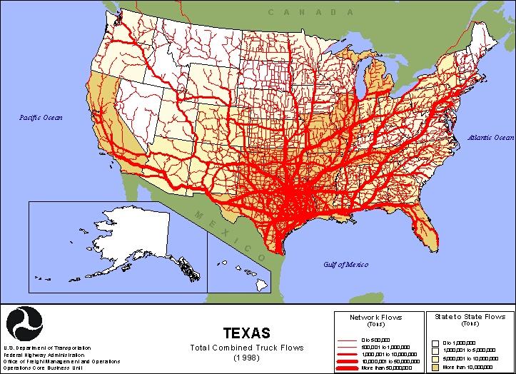
Flow maps are line maps that show direction and possibly intensity of flow of subjects or objects between points. The can be actual paths or "desire lines" depicting the general direction. Flow maps can be used to demonstrate social networks, travel in various forms, or routes for exchange of goods or services. This 1998 flow map shows Texas trucking flows in a network, and state to state.
http://www.lib.utexas.edu/maps/texas/combtrk_tx_1998.jpg


Sunday, November 16, 2008

Isolines Map (with a Bonus)

http://www.scielo.cl/fbpe/img/rchnat/v76n2/img14-07.gif
Isolines are akin to contour lines. Both are types of hypsometric maps, which we have seen earlier. Isolines form lines based on equal value. (Elevation lines are one type of isolines and were described in a previous post.)
This maps shows ocean depth and Caprellidea (skeleton shrimp and whale lice http://animaldiversity.ummz.umich.edu/site/accounts/classification/Caprellidea.html).
It is a nice GIS sample; it also uses porportional circles for the Caprellidea population.

Proportional Circle Map

http://www.neiu.edu/~jrthomas/377/circle.jpg
This type of map is another point pattern map (as is the dot distribution map). Each circle illustrates information via proportion and size of the variable it is measuring rather than simply the location. A scale or range is provided to specify the information.

Choropleth Map

http://images.google.com/imgres?imgurl=http://www.nass.usda.gov/research/atlas02/Crops/Hay%2520and%2520Forage%2520Crops%2520Harvested/Hay%2520-%2520All%2520Hay%2520Including%2520Alfalfa,%2520Other%2520Tame,%2520Small%2520Grain,%2520and%2520Wild,%2520Harvested%2520Acres-choropleth%2520map.gif&imgrefurl=http://www.nass.usda.gov/research/atlas02/index.html&usg=__GU_qGw1FtZsoUtL4VrAsyxSX1Oc=&h=612&w=792&sz=83&hl=en&start=2&tbnid=r--6ddjd8jE-dM:&tbnh=111&tbnw=143&prev=/images%3Fq%3Dchoropleth%2Bmaps%26gbv%3D2%26hl%3Den%26sa%3DX

Choropleth maps are maps of specifically defined areas such as states, counties or districts, and can give a wide variety of information depending on which type is used. There is a later post that will make more distinctions.

This choropleth map demonstrates the value of crops in specific areas as a portion of the total market value of crops sold in 2002. Important items to consider when creating or using choropleth maps incude the area or regions depicted (states, counties, districts, etc), whether they are areally averaged or not, and how the steps or classes are broken down (i.e. equal steps, quatiles, natural breaks or mininum variance.)

Dot Distribution of Wheat Harvest 2002

Dot distribution maps provide a way to demonstrate information simply. Each dot represents a set scale; in this case 1 dot=1,000 acres of wheat harvested. This is a dot density point pattern map using nonproportional dots. Quadrat or Nearest Neighbor Analysis can be used to evaluate point patterns for random, uniform or clustered patterns.
http://www.nass.usda.gov/research/atlas02/Crops/Field%20Crops%20Harvested/Wheat/All%20Wheat%20for%20Grain,%20Harvested%20Acres-dot.gif

Propaganda Maps: Do you see what I see?


http://images.google.com/imgres?imgurl=http://go.owu.edu/~jbkrygie/krygier_html/geog_222/geog_222_lo/geog_222_lo17_gr/infantmortal.jpg&imgrefurl=http://go.owu.edu/~jbkrygie/krygier_html/geog_222/geog_222_lo/geog_222_lo16.html&usg=__kTkIAcWnEQ0_qC9sc0uCnm7HZsM=&h=481&w=432&sz=85&hl=en&start=3&tbnid=vnUvLicK0ZxmzM:&tbnh=129&tbnw=116&prev=/images%3Fq%3Dpropaganda%2Bmaps%26gbv%3D2%26hl%3Den%26sa%3DG


These are more pronounced Propaganda Maps. However, our class notes and discussions consistently re-enforced the fact that subtle forms of misinformation or agenda can be built into maps, and that the user should analyze them carefully. Orientation, projection, scale, and construction of space concepts are a small sample of the areas where map information- in any form- can be distorted.